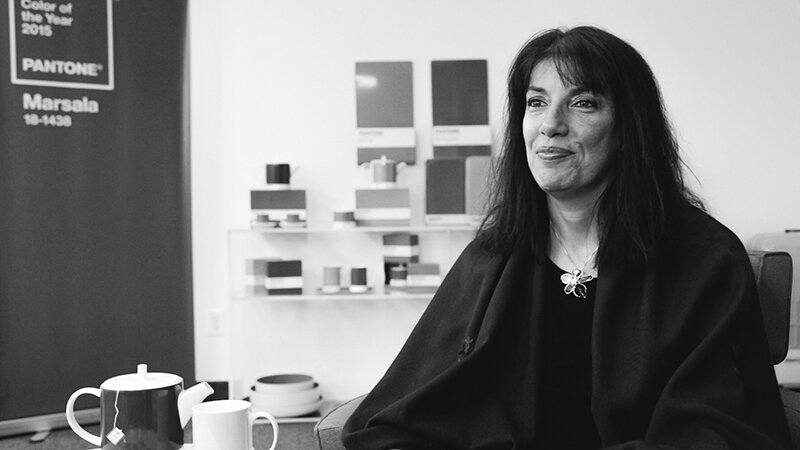
Интервью с Лори Прессман, вице-президентом Института цвета Pantone
Лори, расскажите о том, почему и как начался этот процесс. Когда был учрежден конкурс Pantone Color of the Year?
В 1999 году Институт цвета Pantone создал образовательную программу Pantone Color of the Year, чтобы вовлечь дизайнерское сообщество и энтузиастов цвета по всему миру в дискуссию о цвете. Мы хотели привлечь внимание к взаимосвязи между культурой и цветом — показать нашей аудитории, как то, что происходит в нашей глобальной культуре, выражается и отражается через язык цвета.
В 2024 году Pantone Color of the Year исполняется 25 лет. Есть ли у вас какие-то мысли по этому поводу? Как выросло его наследие за последние 25 лет?
На протяжении многих лет программа Pantone Color of the Year стала всемирно известным культурным ориентиром, захватив воображение многих дизайнеров, брендов и потребителей.
Отмечая 25-ю годовщину нашей программы Pantone Color of the Year и фундаментальную роль, которую цвет играет в нашем общем человеческом опыте, мы надеемся, что вдохновили вас взглянуть на цвет по-другому — что цвет и его связь с эмоциями и выражением человеческих чувств приобретут новое значение. заставляя ваш взгляд в течение дня задерживаться на оттенках и тонах, которые вас окружают, по мере того, как история разворачивается от момента к моменту.
С тех пор, как в 15 году мы представили PANTONE 4020-1999 Cerulean Blue в качестве первого цвета Pantone года, мы видели, как эта программа повлияла на разработку продуктов и решения о закупках почти во всех отраслях и странах мира. Его популярность растет с каждым годом, и его влияние ощущается в моде, декоративной косметике, предметах интерьера, автомобильном и промышленном дизайне, а также в продуктах, упаковке, мультимедийном дизайне и коммерческих интерьерах.
Мы благодарны за то, что предоставили возможность, где дизайнеры и энтузиасты цвета по всему миру чувствуют себя в силах рассказать свои собственные истории с помощью языка цвета и продемонстрировать свое творчество в своих сообществах. Мы с нетерпением ждем продолжения этой работы еще много лет.
Кто определяет цвет года по версии Pantone?
Графика, показывающая примеры предыдущих цветов года Pantone, чтобы проиллюстрировать, как выбирается цвет года Pantone.
Каждый год наша команда экспертов по цвету из Института цвета Pantone прочесывает весь мир в поисках новых цветовых влияний. Это может включать в себя индустрию развлечений и фильмы в производстве, передвижные коллекции произведений искусства и новых художников, моду, все области дизайна, амбициозные туристические направления, новый образ жизни, стили игры или приятные побеги, а также социально-экономические условия. Влияние также может быть связано с новыми технологиями, материалами, текстурами и эффектами, которые влияют на цвет, соответствующими платформами социальных сетей и даже предстоящими спортивными событиями, которые привлекают внимание всего мира.
Anything and everything taking place in our culture during the year can influence our Pantone Color of the Year selections, with each source carrying a different weight from year to year depending on what’s taking place in our culture at that time. For example, if you look back to 15 years ago, technology would have played an infinitesimal role. Today that is no longer the case. Gaming, social media, augmented and virtual reality, and physical design itself are all influenced by our technology and the colors we can access in the digital environment.
How does the selection process work? How does Pantone decide the Color of the Year every year?
The Pantone Color of the Year selection process entails thoughtful consideration and trend analysis. It is a culmination of the macro-level color trend forecasting and research that the global team involved with the Pantone Color Institute conducts year-round that informs this selection, as well as the colors that get included into our color trend forecasting products.
We approach our color selection in a very pure way. No one on our global team comes to any Pantone Color of the Year discussion with a commercial agenda or personal preferences. Instead, we each approach our Pantone Color of the Year color selection in a very pure way. As we like to say, “we love all of our colors equally.”
There’s also a misconception that we gather a bunch of color influencers in a room one day and emerge with the decision. As many of our Pantone Color Institute team members own their own design studios, contribute to key influential global trend forecasts, work with clients prescribing color choices for brand or product visual identity, and even teach classes on color, their daily conversations are rooted in color and design, including material and surface finish.
As a result, conversations relating to the Pantone Color of the Year selection do not take place in one isolated meeting at a specific time of year. It is one long, continuously flowing conversation among a group of color-attuned people. Our Pantone Color Institute team members come from a wide range of design, cultural, and geographical backgrounds. The commonality that brings them together is their expertise in color and design, and their ability to see the world through the lens of color. That’s why I liken them to being color anthropologists. They have this intuitive ability to connect all that is taking place in the world and translate it into the language of color.
What’s especially fascinating to me about the Pantone Color of the Year selection process is that although our Pantone Color Institute members reside in disparate locations and are involved in differing areas of design, we are always able to come to a consensus.
Sure, there are different perspectives that come up and we carefully look at them all, but because the Pantone Color of the Year reflects what is taking place in our global culture at that moment in time, many of our observations and what we see visually showing up can be quite similar. We discuss our color psychology and color trend research as we look to connect the mood of the global zeitgeist with the corresponding color family. From there, we drill down further to identify the exact right shade.
It is always a challenging process and sometimes we need to look at alternative ways to express our color message. For Pantone Color of the Year 2016 and Pantone Color of the Year 2021, we brought together two colors to tell our story.
PANTONE Color of the Year 2016 was a blend of two shades, PANTONE 13-1520 Rose Quartz and PANTONE 15-3919 Serenity, that came together to reflect connection and wellness as well as convey a soothing sense of order and peace.
For Pantone Color of the Year 2021, our two independent colors, PANTONE 17-5104 Ultimate Gray + PANTONE 13-0647 Illuminating, highlighted how different elements come together to support one another.
And, for the first time for our Pantone Color of the Year selection in 2022, PANTONE 17-3938 Very Peri, we created a brand new color as we did not have the exact right color we needed to convey the message.
We also consider the color name in our selection process as names immediately conjure up an image and a feeling. We want to make sure that the name of our Pantone Color of the Year resonates and can easily and intuitively convey the message we are looking to send.
Graphics showing examples of previous Pantone Colors of the Year to illustrate how Pantone Color of the Year is chosen.
What does the selection of the Pantone Color of the Year represent?
The color we select to be our Pantone Color of the Year is bigger than one region or one sector of design. It is a color we see crossing all areas of design — a color that serves as an expression of a mood and an attitude on the part of consumers, a color that will resonate around the world, a color that reflects what people are looking for, a color that can hope to answer what people feel they need.
That’s the difference between a more short-lived fad and a lifestyle trend. Pantone Color of the Year is reflective of a lifestyle trend. It’s about what’s happening in the zeitgeist at a macro level. It's not going to represent a singular trend that you can only find in the US or only find in Asia. It’s global.
The emotional aspect of color is also a large aspect of our decision making. We want to ensure that the colors we select reflect what is taking place in our global culture at a specific moment in time. With color and context so intertwined, there really are reasons why a color family or individual color comes into prominence when it does. For the most part, the popularity of a color is symbolic of the age we live in. So, while each year is unique, and we look at each year separately, we also do look back to where we have been since we began this program in 1999.
Why does Pantone pick the Color of the Year? In other words, what makes the Pantone Color Institute the global authority on color?
Pantone is in the business of color. Since 1963, Pantone has provided color solutions for all our client’s color needs. Today, Pantone’s color language is used by designers worldwide to access color trends, communicate color choices, and control consistency of color across every imaginable surface, texture, material, and finish.
Founded in 1985, the Pantone Color Institute educates, inspires, and promotes fluency in the language of color. Executive Director Leatrice Eiseman, who helped to start the Pantone Color Institute, has a background in color, design, and psychology. The ongoing color preference study research which she conducts through the Pantone Color Institute serves as the foundation for who we are and all that we do.
Why is Pantone Color of the Year important? When the program is successful, what happens to the world?
It’s important to remember that the goal of the program isn’t to promote one particular color, although we do see that colors we select to be our Pantone Color of the Year increase in popularity, and once integrated into the cultural mindset, become even more influential the following year.
The goal of the program is to help companies and consumers better understand the power color can have. We want to highlight color’s role as a silent language to teach them how to leverage color’s power and expressiveness to influence perception — whether it be to create a more successful design strategy that will increase consumer engagement, or to better showcase your own personal identity.
Для компаний Pantone Color of the Year демонстрирует, что цвет является важной частью решения потребителя покупать что-то или нет. Потребители осознают, какое впечатление они могут произвести с помощью цвета. В любой день цвета, которые вы выбираете, влияют на ваше настроение и на то, как вы хотите, чтобы другие воспринимали вас. Цвет является важной частью послания, которое вы посылаете миру.
Цвет — наш самый важный мощный инструмент коммуникации. Это первое, что мы видим, и первое, к чему мы подключаемся. Это визуальный язык, который мы все понимаем, послание которого пересекает полы, поколения и географические регионы.
Узнавая больше об уникальных значениях, которые дают определенные цвета, мы становимся более выразительными, тесно связанными обществом, которое дает людям более целостное понимание как своих сверстников, так и сообществ. Будучи всемирно признанным визуальным языком, цвет может сказать то, что не могут сказать слова.