Brief
Yubileynoye was created in honor of the 300th anniversary of the Romanov Dynasty in 1913. It remains to be the favorite delicacy of most Russians for a century: Today, every 5th packet of biscuits sold in Russia is Yubileinoye.
The flour confectionery market began to grow in 2010, and in 2015 the situation on the market was favorable which attracted new remarkable brands. The conservative and reserved packaging of Yubileinoye needed to be changed due to this increase in competition. Our challenge was to redesign the packaging: to develop a powerful brand block and to offer a system for subranges.
Solution
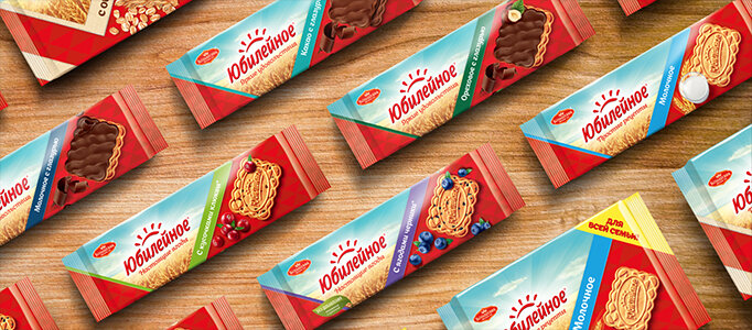
The design solution was built on preserving and strengthening brand awareness and traditions. A pattern consisting of two coloured isosceles triangles had been placed on Yubileinoye packaging since 1967. We decided to continue with this traditional identity. The enlarged triangle became the central element of the pack. A placement system for subranges and tastes was created with its help. The introduction of this element allowed us to structure the composition and make it more definite and easier to understand. The updated food zone demonstrates the product clearly and openly, which shows the consumer the transparency of the brand. Embedded berries, chocolate chips and wheat slems strengthen the food zone and provide differentiation on subranges.
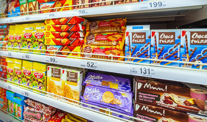
The updated design allowed us to differentiate the packaging. When displayed in stores, a powerful brand block is created no matter how the packages of cookies are located on the shelf. The redesign is built on rethinking the recognizable brand elements stirring emotional warmth among Yubileinoye fans.