Color plays an important role in the design. In order to avoid incorrect visual interpretations, psychologists advise to take into account when developing layouts as well as social location and national characteristics of color perception of future "viewers". The perceived visual message due to the color has a stronger emotional reaction on the viewer. Thus, a well-chosen color scheme in the overall compositional structure increases its expressiveness, imagery, memorability.
Color, as if any element of the composition, should be carefully thought out together with the position of maximum compliance with the created image. The principle of color matching is consonance, based on soft or contrasting color ratios. This, in turn, contributes to the creation of the viewer about the state of calm, balance or, topsy-turvy-activity, dynamics, catchiness.
Features of color perception based on associations have the right to be taken into account in the design of any object design graphics. Provided that, for example, the object of advertising is designed for foreign viewers, in this case should be taken into account the national characteristics of the perception of colors, then to avoid incorrect visual interpretations. Observed the existence of a relationship between the color preferences of the buyer and his social status. That way, "bright," flashy " colors are much more popular with people with low incomes, at the same time as if most of the wealthy people who have achieved success prefer restrained colors."
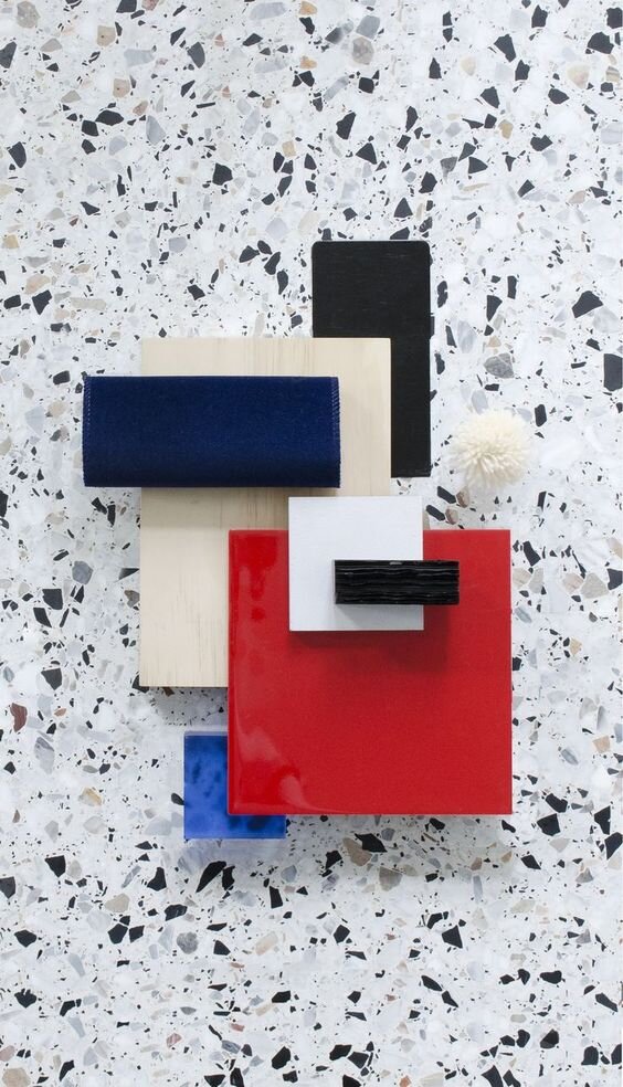
Emotional and spatial parameters of the most common colors are as follows:
- yellow-visually removes, enhances, expands, irritates; forms a feeling of warmth, dryness, lightness, looseness; mood cheerfulness, fun;
- orange-visually approximates, thickens; forms a feeling of dryness, high temperature; mood of joy;
- purple - visually reduces, shrinks; produces a feeling of coolness, strength, massiveness, richness, emotionally depriving will; suggests sadness;
- blue - visually reduces, shortens; produces a sensation of cold, humidity, density; emotionally makes passive; comforting, focusing, soothing; supine, antiseptic, neat;
- green - visually, little narrows, unites; produces a sensation of cold; emotionally soothing, balancing; good, healthy, natural;
- red - visually closer limits; produces a feeling of warmth, heaviness; ons. Additionally: red color is not suitable with the purpose of appeals to the older generation, that way it's like Enya#0но color carries the following parameters: dynamism, activity, aggression, sexuality, simvoliziruet danger;
- white-visually pushes, expands, increases; forms a feeling of lightness and looseness; emotionally leaves indifferent;
- black - visual approaches, reduces; produces a feeling of oppression, weight, density; makes emotionally stable; despair, death, originality, generosity, elegance, classic stylish color;
- gray-visually nothing does not update; forms a feeling of indifference; a sense of moderation, solidity.