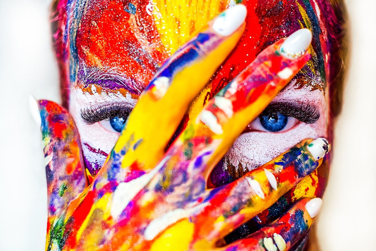
Color in imageology is as important a tool as form and texture. With the help of color, we can create images that create a specific impression. He does not leave us indifferent because he represents "visualized feelings." Many are interested in knowing how color affects a person. For example, it has already been proven that the human brain cannot react equally to blue and red. The same objects in mass and volume, but painted in different colors - are able to give the impression of lighter or, conversely, heavy. A room in blue-green tones will feel more cold and inhospitable than a similar room with yellow walls, and by several degrees. In fact, a lot of material has been published with interesting studies on color, and if you dig a little deeper, you can find facts / results on bookshelves. You can also take into account color features in creating the image in order to plan your impression of yourself in advance.
RESEARCH OF COLOR
It is known that the information we perceive is 80% visual. This means that initially we see, then hear, then we hear the smell and so on. The question is what exactly we see, and in what sequence the colors appear before us. This is important to consider when planning an image. In one set, you may need to highlight something spectacularly, and skillfully hide something. And the color will help a lot in this. Using a tachistoscope, a study was conducted on the speed of color perception. The testees were asked which of the flowers they saw first (the experiment of Favre and November).
And this is what came of it:
- Orange - 21%
- Red - 19%
- Blue - 17%
- Black - 13%
- Green - 12.5%
- Yellow - 12%
- Purple - 5.5%
- Gray - 0.5%
Another test showed a connection between lifestyle, age and social status, which have a direct impact on the choice of color for your life (clothing, interior, car color, etc.). This information can both "sober up" and encourage a change in habits in choosing shades. Personally, as an image consultant, this information seemed very interesting, and most importantly structured.
- Children prefer all the basic colors, do not like mixed colors.
- Young people are bright, cheerful colors.
- And teenagers are unexpectedly rare, complex colors.
- Adults - saturated, radiant colors, mixed colors.
- Older people are dark, faint colors.
- High-income people - pastel colors, color combinations, subtle color nuances (tone-on-tone), delicate pure colors.
- People with lower incomes have bright, primitive colors, including flashy shades.
- Citizens - cold tones, mostly blue and green, pastel colors.
- Rural people - saturated colors, a tendency to red color and all kinds of patterns.
- People engaged in mental work are blue.
- By physical labor - red color.
- Introverts - heavy, dark colors, mixed colors, heterogeneous.
- Extroverts are brilliant, saturated colors.
SIGNIFICANCE OF SHADES
The following is a description of each color from the perspective of weaknesses and strengths. These criteria can be used depending on the mood and goals, in almost any field. When developing a corporate and corporate style, when forming a set of clothes, when choosing ceramic tiles and wallpaper in your home.
Green Strengths: growth, development, persistence, self-sufficiency, tenacity, security. Weaknesses: static, passive, slow, inert
Orange Strengths: lively, resilient, warm, dry, close. Weaknesses: rusty, immature conceited, intrusive, aggressive
Purple Strengths: sensitivity, variability, emotionality, credulity, intimacy. Weaknesses: sad, melancholy, weak, not serious, lonely, painful
Brown Strengths: stable, durable, helpful, calm, comfortable, reliable, maturity, solid origin. Weaknesses: passive, clumsy, simple wat, boring
Yellow Strengths: moving, dynamic, joyful, open to the world, moving, curious. Weaknesses: impudent, obsessive, superficial, irritated, changeable.
Black Strengths: solemnity, elegance, desire to be different, distance, erotic, mysterious. Weaknesses: denial, aggression, authoritarianism, slowdown, stagnation, necrosis
Red Strengths: energy, strength, power, masculinity, dominance. Weaknesses: restless, threatening, capture, boastful, signal
Blue Strong sides: soul, depth, fidelity, safe, satisfaction, reflection. Weaknesses: lethargy, boredom, passive, closed, longing.
White Strengths: resolution, release, purity, inaccessibility, truth, purity. Weaknesses: emotional sterility, challenge, emptiness, dissolution.
It should also be remembered that there are colors - loved and not loved. This is a subjective assessment of a particular shade, based on previous experience. It is possible that the blue color in a person can be associated with the sea, or rather with a situation in which he almost drowned. Whatever version of blue is offered to him - he will refuse, since fear is fixed in this color. Most likely blue will go into the category of unloved color. And shades are successful and not successful. And this is a clearly objective criterion, which is based on the external data of a person (client) - its natural color.
Namely, the color of the eyes, hair, skin tone, eyebrow color, skin susceptibility to tanning, etc. In this case, if you determine exactly your appearance, you can identify successful and unsuccessful shades that are recommended for use in clothing and interior. It is successful colors that will help to look fresher, younger and more welcoming to others. Ideal when your favorite and successful colors match.
But, even if the unlovers are shown by the image consultant as successful, I recommend just finding the right shade. After all, any color is always a huge range of many shades. And this is a choice and an opportunity to choose what will be most pleasing to the eye.