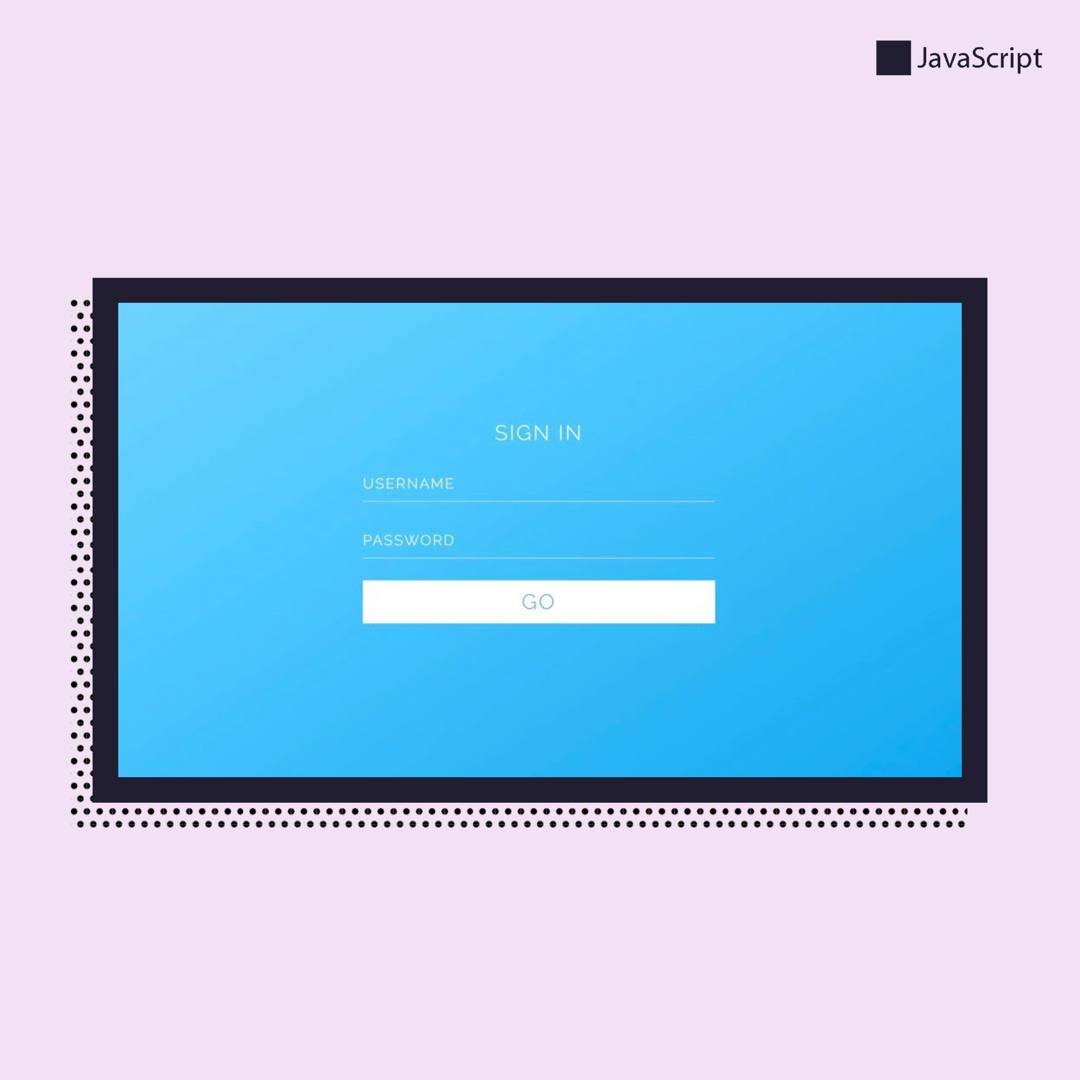
Вы можете создать для своего сайта форму входа, которая появляется после нажатия на кнопку, с помощью готового кода ниже.
html
<link href='https://fonts.googleapis.com/css?family=Raleway:400,500,300' rel='stylesheet' type='text/css'>
<div id="mainButton">
<div class="btn-text" onclick="openForm()">Sign In</div>
<div class="modal">
<div class="close-button" onclick="closeForm()">x</div>
<div class="form-title">Sign In</div>
<div class="input-group">
<input type="text" id="name" onblur="checkInput(this)" />
<label for="name">Username</label>
</div>
<div class="input-group">
<input type="password" id="password" onblur="checkInput(this)" />
<label for="password">Password</label>
</div>
<div class="form-button" onclick="closeForm()">Go</div>
<div class="codepen-by">CodePen by Cole Waldrip</div>
</div>
</div>
<div class="codepen-by">CodePen by Cole Waldrip</div>
CSS
$shadow1 : 0 1px 3px rgba(0,0,0,0.12), 0 1px 2px rgba(0,0,0,0.24);
$shadow2 : 0 3px 6px rgba(0,0,0,0.16), 0 3px 6px rgba(0,0,0,0.23);
$shadow3 : 0 10px 20px rgba(0,0,0,0.19), 0 6px 6px rgba(0,0,0,0.23);
$shadow4 : 0 14px 28px rgba(0,0,0,0.25), 0 10px 10px rgba(0,0,0,0.22);
$shadow5 : 0 19px 38px rgba(0,0,0,0.30), 0 15px 12px rgba(0,0,0,0.22);
@mixin transition($transition...) {
-webkit-transition: $transition;
-moz-transition: $transition;
-ms-transition: $transition;
-o-transition: $transition;
transition: $transition;
}
@mixin transform($transform) {
-webkit-transform: $transform;
-moz-transform: $transform;
-ms-transform: $transform;
-o-transform: $transform;
transform: $transform;
}
*, *:before, *:after {
margin: 0;
padding: 0;
box-sizing: border-box;
}
body {
color: #999;
padding: 20px;
display: flex;
min-height: 100vh;
align-items: center;
font-family: 'Raleway';
justify-content: center;
background-color: #fbfbfb;
}
#mainButton {
color: white;
border: none;
outline: none;
font-size: 24px;
font-weight: 200;
overflow: hidden;
position: relative;
border-radius: 2px;
letter-spacing: 2px;
box-shadow: $shadow1;
text-transform: uppercase;
background-color: #00a7ee;
@include transition(all 0.2s ease-in);
.btn-text {
z-index: 2;
display: block;
padding: 10px 20px;
position: relative;
&:hover {
cursor: pointer;
}
}
&:after {
top: -50%;
z-index: 1;
content: '';
width: 150%;
height: 200%;
position: absolute;
left: calc(-150% - 40px);
background-color: rgba(255,255,255,0.2);
@include transform(skewX(-40deg));
@include transition(all 0.2s ease-out);
}
&:hover {
cursor: default;
box-shadow: $shadow3;
&:after {
@include transform(translateX(100%) skewX(-30deg));
}
}
&.active {
box-shadow: $shadow5;
.modal {
@include transform(scale(1, 1));
}
}
.modal {
top: 0;
left: 0;
z-index: 3;
width: 100%;
height: 100%;
padding: 20px;
display: flex;
position: fixed;
align-items: center;
justify-content: center;
flex-direction: column;
background-color: inherit;
transform-origin: center center;
background-image: linear-gradient(to top left, #00a7ee 10%, lighten(#00a7ee, 20%) 65%, white 200%);
@include transform(scale(0.000001,0.00001));
@include transition(all 0.2s ease-in);
}
}
.close-button {
top: 20px;
right: 20px;
position: absolute;
@include transition(opacity 0.2s ease-in);
&:hover {
opacity: 0.5;
cursor: pointer;
}
}
.form-title {
margin-bottom: 15px;
}
.form-button {
width: 100%;
padding: 10px;
color: #00a7ee;
margin-top: 10px;
max-width: 400px;
text-align: center;
border: solid 1px white;
background-color: white;
@include transition(color 0.2s ease-in, background-color 0.2s ease-in);
&:hover {
color: white;
cursor: pointer;
background-color: transparent;
}
}
.input-group {
width: 100%;
font-size: 16px;
max-width: 400px;
padding-top: 20px;
position: relative;
margin-bottom: 15px;
input {
width: 100%;
color: white;
border: none;
outline: none;
padding: 5px 0;
line-height: 1;
font-size: 16px;
font-family: 'Raleway';
border-bottom: solid 1px white;
background-color: transparent;
@include transition(box-shadow 0.2s ease-in);
+ label {
left: 0;
top: 20px;
position: absolute;
pointer-events: none;
@include transition(all 0.2s ease-in);
}
&:focus {
box-shadow: 0 1px 0 0 white;
}
&:focus,
&.active {
+ label {
font-size: 12px;
@include transform(translateY(-20px));
}
}
}
}
.codepen-by {
left: 0;
bottom: 0;
width: 100%;
padding: 10px;
font-size: 16px;
position: absolute;
text-align: center;
text-transform: none;
letter-spacing: initial;
}
JS
var button = document.getElementById('mainButton');
var openForm = function() {
button.className = 'active';
};
var checkInput = function(input) {
if (input.value.length > 0) {
input.className = 'active';
} else {
input.className = '';
}
};
var closeForm = function() {
button.className = '';
};
document.addEventListener("keyup", function(e) {
if (e.keyCode == 27 || e.keyCode == 13) {
closeForm();
}
});