Вы можете воспользоваться кодом ниже, чтобы создать анимацию перетекающего фона на HTML, CSS и JavaScript.
html
<p>click</p>
<svg xmlns="http://www.w3.org/2000/svg" id="bgart" version="1.1" viewBox="100 100 600 600" preserveAspectRatio="xMidYMid slice">
</svg>
<svg style="pointer-events:none;">
<defs>
<linearGradient id="bggrad" x1="0%" y1="0%" x2="100%" y2="100%">
<stop offset="0%" />
<stop offset="100%" />
</linearGradient>
</defs>
</svg>
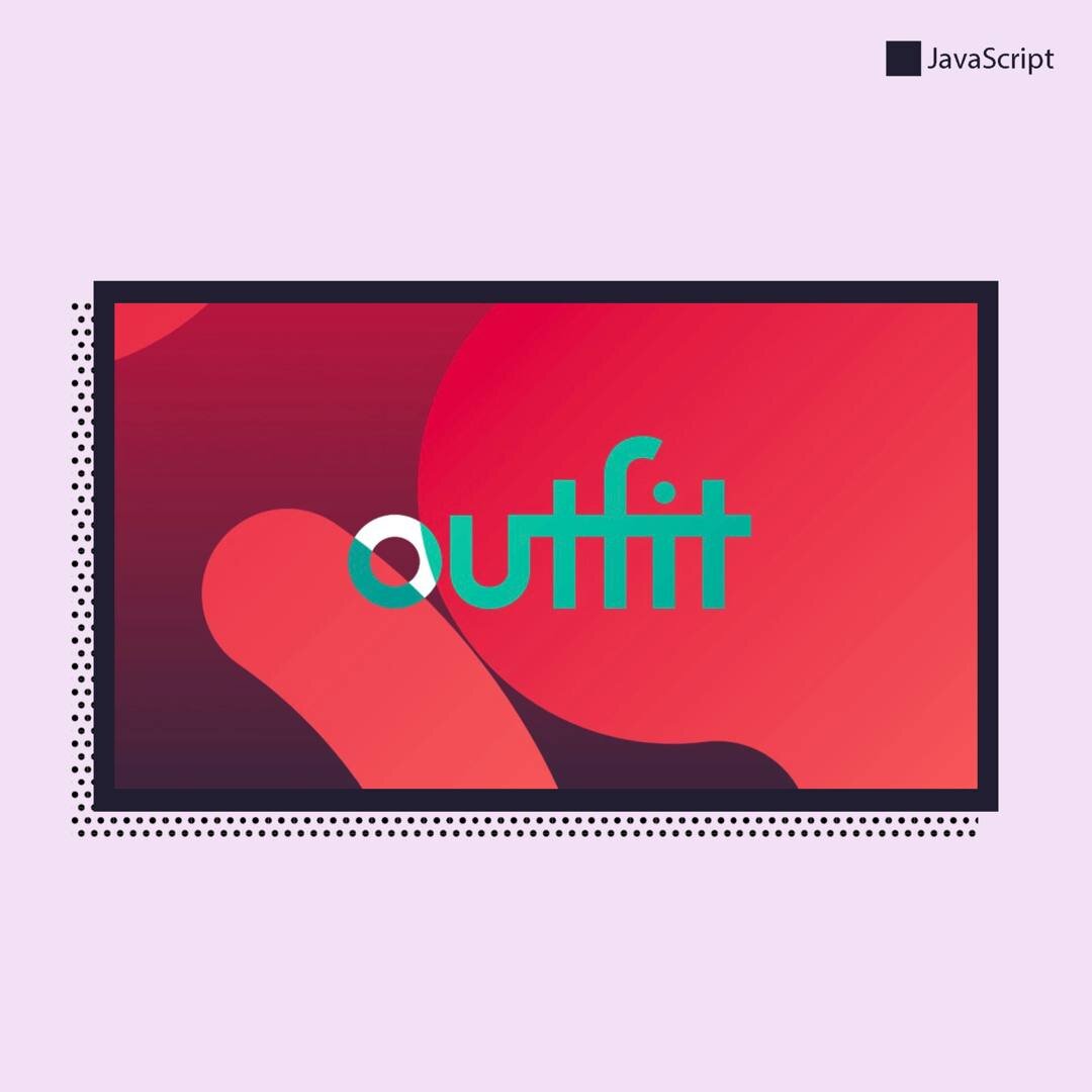
<svg class="outfit-logo" viewbox="0 0 90 50" stroke="currentcolor" stroke-width="4" fill="none">
<circle cy="28.5" cx="17.5" r="6.5" />
<path d="M82 22H40v8c0 6.6-10.5 7-10.5 0v-9.9M48.2 37V13.7m18 23.3V22m9-8.3V37m-17.8 0V13c0-5.4 5-6 7.7-4.6" />
<circle cy="16" cx="66.3" r="2" fill="currentcolor" stroke="none" /></svg>
CSS
:root {
--bgtime: 160s;
/* brand hues */
--brand-h: 341.6;
--indigo-h: 222.2;
--navy-h: 210.9;
--teal-h: 184.9;
--brown-h: 356.3;
--salmon-h: 7.8;
--dark-h: 210;
--base1-h: 165;
--base2-h: 195;
/* compiled defaults */
--bg: hsl(0, 0%, 100%);
--fg: hsl(0, 0%, 0%);
--brand: hsl(var(--brand-h), 100%, 44.7%);
--indigo: hsl(var(--indigo-h), 37.4%, 19.4%);
--navy: hsl(var(--navy-h), 49.7%, 39%);
--teal: hsl(var(--teal-h), 19.4%, 62.5%);
--brown: hsl(var(--brown-h), 13.1%, 23.9%);
--salmon: hsl(var(--salmon-h), 100%, 72.7%);
--dark: hsl(var(--dark-h), 33.3%, 9.4%);
--base1: hsl(var(--base1-h), 6.6%, 76.1%);
--base2: hsl(var(--base2-h), 4.4%, 82.4%);
}
body {
overflow: hidden;
background-color: hsl(var(--base2-h), 4.4%, 92.4%);
height: 100vh;
background-image: linear-gradient(var(--brand) -20%, var(--indigo) 120%);
}
svg {
position: fixed;
top: 0;
bottom: 0;
left: 0;
right: 0;
height: 100vh;
width: 100vw;
margin: 0;
}
#bgart circle {
fill: transparent;
stroke: url(#bggrad);
stroke-linecap: round;
animation: bgmove 170s linear infinite;
}
#bggrad [offset="0%"] {
stop-color: var(--brand);
}
#bggrad [offset="100%"] {
stop-color: var(--salmon);
}
@keyframes bgmove {
0% {
stroke-dashoffset: 1000;
}
100% {
stroke-dashoffset: 0;
}
}
.outfit-logo {
color: var(--bg);
mix-blend-mode: difference;
position: absolute;
display: block;
top: 25vh;
left: 25vw;
width: 50vw;
height: 50vh;
pointer-events: none;
}
p {
pointer-events: none;
text-align: Center;
color: white;
font-family: sans-serif;
position: relative;
z-index: 999;
user-select: none;
}
JavaScript
let svg = document.getElementById("bgart");
function drawCircles() {
for (i = 0; i < 5; i++) {
circle = document.createElementNS("http://www.w3.org/2000/svg", "circle");
circle.setAttribute("r", Math.floor(Math.random() * 900) + 30);
circle.setAttribute("cx", Math.floor(Math.random() * 900));
circle.setAttribute("cy", Math.floor(Math.random() * 900));
circle.setAttribute("stroke-width", Math.floor(Math.random() * 400 + 15));
function getRandomLength() {
return Math.floor(Math.random() * 500 + 100);
}
function getRandomGap() {
return Math.floor(Math.random() * 500 + 900);
}
circle.setAttribute(
"stroke-dasharray",
`${getRandomLength()} ${getRandomGap()}`
);
svg.appendChild(circle);
}
}
function removeAll() {
while (svg.firstChild) {
svg.removeChild(svg.lastChild);
}
}
svg.addEventListener("click", function () {
removeAll();
drawCircles();
});
drawCircles();