Как создать бренд с нуля / How to create a brand from scratch
15 сентября 202115 сен 2021
...Читать далее
How to create a brand from scratch?
We tell you about the example of the bakery "Esh Hleb" (Eat Bread)
How to create a brand from scratch?
We tell you about the example of the bakery "Esh Hleb" (Eat Bread)
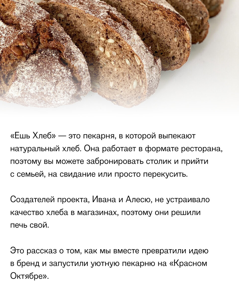
"Eat Bread" is a bakery where natural bread is baked. It works in the format of a restaurant, so you can book a table and come with your family, on a date or just have a snack.
The creators of the project, Ivan and Olesya, were not satisfied with the quality of bread in stores, so they decided to bake their own.
This is a story about how together we turned an idea into a brand and launched a cozy bakery on the "Red October".
Looking for the essence
To turn an idea into a real project, you need to formulate the concept and essence. That's where we started.
Ivan and Alesya told us what they are not satisfied with in the catering: this is the low quality of products and the opacity of the cooking process. In their bakery, they wanted to prepare bread and some other dishes from high-quality ingredients. And also make the kitchen transparent so that guests can see everything that happens there.
After several hours of communication with the founders, we formulated the characteristics of the brand:
- the combination of tradition and modernity
- simplicity and quality
- brutality and friendliness
- honesty and openness
After several hours of communication with the founders, we formulated the characteristics of the brand:
- the combination of tradition and modernity
- simplicity and quality
- brutality and friendliness
- honesty and openness
We draw a portrait of the client
We wondered what criteria the target audience of such a bakery might have. If you understand this, you will be able to quickly enter the market without rejection on his part.
We have: high requirements for the quality of dishes and products, the desire to lead a healthy lifestyle and the desire to take care of your health. If we put everything together, we will see the image of a typical resident of a megalopolis: a representative of the middle class who is tired of bad ecology and fast food. He needs healthy and natural food.
A detailed portrait of the client helped us choose the location of the restaurant. "Red October" is a place where the maximum number of people with similar values meets.
We develop a logo and corporate identity
To develop competent visuals, you need to start from the brand values. We decided to try options with the image of bread, but nothing came of it.
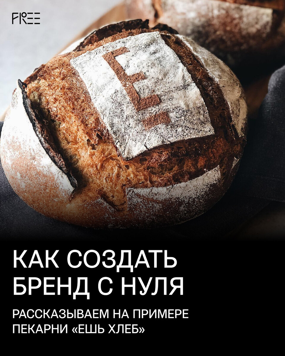
Then we turned to the Old Russian alphabet to convey the tradition. We interpreted the letter " E " from the Glagolitic and Cyrillic alphabet in a modern way using a dash under the letter. In general, an underscore when writing is a symbol of importance and significance.
We develop a logo and corporate identity
To develop competent visuals, you need to start from the brand values. We decided to try options with the image of bread, but nothing came of it.
Then we turned to the Old Russian alphabet to convey the tradition. We interpreted the letter " E " from the Glagolitic and Cyrillic alphabet in a modern way using a dash under the letter. In general, an underscore when writing is a symbol of importance and significance.
We also synthesized the bakery's slogan from history. In ancient Russian, the letter "Is" had 2 meanings: "to eat" and "to be". Therefore, the slogan of the restaurant sounds like this: "E means to eat!".
We chose white, black and beige as our corporate colors. The first two emphasize the character of the brand: openness and honesty are combined with brutality and straightforwardness. Beige is similar to the color of bread and well conveys the friendliness and "craftiness" of the brand.
Materialize the idea
Most branding studios finish working with the client at the stage of creating a corporate identity and logo. Few people take up production, and because of this, a lot of little things and elements are lost. Therefore, we finish projects only after the production stage and control the entire process ourselves.
The facade of the building of the bakery-restaurant "Eat Bread" was initially unsightly: wires were sticking out everywhere, and there were holes in the walls. We created a sign with a length of 18 meters to cover all this. And then we agreed on the placement and proved the safety of such a design.
We created a pattern for packaging paper: we painted a loaf and printed it on paper. The resulting pattern very accurately conveys the authenticity of the product.
One of the most important characteristics of the brand is cleanliness. Therefore, we have developed eco-leather aprons for restaurant waiters. They do not have to be washed, you just need to wipe and disinfect — you can not distinguish them from the new one.
To summarize
From the idea and the sketch of the logo on paper, we got a working brand and a restaurant on the "Red October". It only took a couple of months of work and the efforts of the whole team to add.
A marketer, a strategist, an analyst, an art director, designers and a project manager took part in all this. And of course, the owners of the company helped.
Without all these people, it is impossible to create a brand and bring it to working condition.