One way or another, a phallic symbol emerges in the work of any man of art. It can even be considered a kind of golden section, which mystically attracts the audience. Provocation unconditionally kindles the flame of interest, but you need to be able to present it competently.
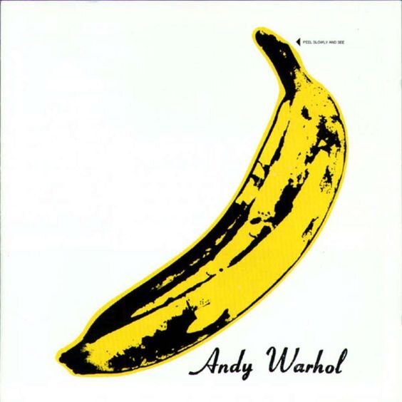
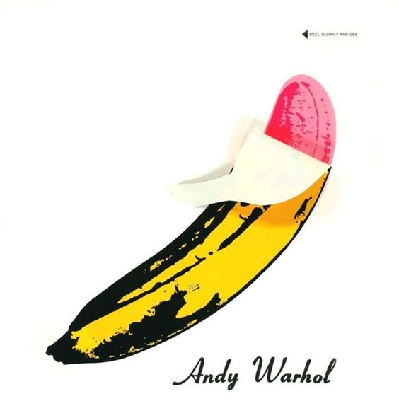
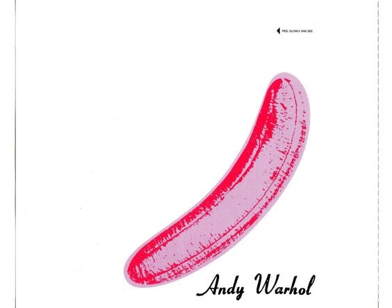
Andy Warhol was the master of the business. He once produced the band Velvet Underground and created the cover for their debut album The Velvet Underground & Nico. Despite the fact that it was a commercial failure from the very beginning, time was of the essence.
In 1966, the audience was ambiguous in its acceptance of experimentally sensitive music with rather controversial lyrical themes, including drug abuse, prostitution, sadomasochism and sexual deviance. Critics, on the other hand, were abstracted and pretended as if they hadn't noticed the novelties.
Today it is one of the most famous and influential albums of popular music. On the list of 500 best albums of all time, presented by Rolling Stone magazine, it took 13th place, and it costs a lot! The uniqueness of the project is not only in its filling, but also in its design. Warhol decorated the cover with a banana image in his own corporate style and added a sharp detail. On the original copies there was an intriguing inscription: "Slowly clean and look". But as soon as the peel was bent off, a gentle pink banana was found underneath, giving room for erotic associations. The process of making such a product was quite complicated and required a special machine, which was one of the reasons for the delay in releasing the album. Most of the re-released vinyl records do not have the function of "sticker", so now the original is a collector's item.
Turns out the next album I like is also my debut album. When The Yardbirds broke up, their guitarist Jimmy Page retained the title and contractual obligations, which included a series of concerts in Scandinavia. After the tour, the new line-up returned to England, where they changed their name to Led Zeppelin and recorded their first album. Its cover was decorated with a historic black-and-white picture of the burning Hindenburg blimp.
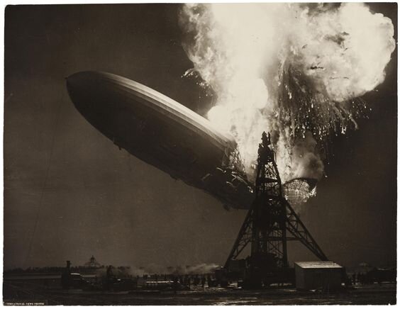
The idea belonged to Paige, and in his opinion, it reflected the whole concept of the group. There is a version of its origin. During discussions with the new line-up, Moon (drummer) joked, "It's probably going to collapse like a lead balloon," and Entwhistle (bass guitar) corrected it: "A lead blimp. But the prophecy was wrong. The band quickly became famous, and the album's release date was January 12, 1969 - Kerrang magazine!
In the history of Russian music there are also covers with references or subtexts. The band Bi-2 and its album Moloko are a vivid example of this. Its musical content is a kind of experiment, as the compositions presented in it differ significantly from the previous repertoire of the band - they actively use electronic instruments.
If the album's music is for the amateur, its cover is very stylish. It refers us to the well-known "Clockwork Orange". In his novel, Anthony Burgess developed an interesting system of swearing and slang expressions for the characters. In Russian editions these words were Russian, but were written in the Latin transcription, an example of such an inscription can be seen on the cover of Bi-2. The very name of the album Moloko refers us to the favorite drug drink of the main character. The image of Leva and Shura on the cover of the album stylistically copy the characters from the cult and eponymous Stanley Kubrick film. It is very authentic and delicious.
I couldn't help but include the Movie band in this top band. Through all her albums there passes a unifying thread of brevity - a true delicacy for visual gourmets. I chose the sixth studio album "Blood Group", the cover of which is essentially plagiarism, but that is its main beauty. At first about the content - the songs included in the record were conquered not only by the Soviet Union, but also abroad. By the way, the album was recorded in parallel with the shooting of the film "Assa" - a worthy film, I advise you to watch at leisure. It is also interesting that the romantic vector in the music has changed into a heroic one, the battle cry is heard in notes and texts.
And now for the decorations, the band hasn't been ceremonial for a long time with the cover. At that time the musicians were impressed by the films of Fritz Lang. It's either a coincidence or a destiny, but Kirsanov, a close friend of the guys and a great artist, worked then in the Russian Museum, where an exhibition of art of the 1920s and 30s took place. There he came across Malevich's poster for the film about Dr. Mabuza (Lang) and the idea of the cover came to him. Kirsanov drew his own version of the poster, which the group immediately approved.
Of course, it's not an exact copy - Dr. Mabuza is replaced by "Blood type" and "Movie". There are still small differences in color tones and proportions of figures, but in general the composition is preserved.