The floor is a very important element of the decoration of the interior. This is the reason why taking time for the choice of materials, color and decorative style is crucial. And yet among all the styles and colors, the gray floor tiles remain one of the classics that combines perfectly with all the decorative trends and soft and warm shades.
Gray floor tiles are often used by professional designers when looking for a modern and elegant look. So, gray floor tiles became the most popular trend in 2018 besides textures, materials, durability, and aesthetics.
And yet, the contemporary look of gray tiles is often ruined by the fact that we forget to take into account some important factors. The gray color is very strong in itself and ignoring this can be a big waste of money. The colors of the walls and the furniture complement and must be complemented by the gray tiles for the creation of a perfect decoration.
Gray is a very strong and very subtle color blend well with most colors regardless of shade. But this does not mean that you can choose any color for your walls. You must not forget to take into consideration the color and shade of the floor tiles. Some of the basic colors blend very well with gray soil, while the combination of gray with others can be a real disaster.
The different shades of gray create a beautiful fusion with a wide variety of colors and take into account the precise shades of your gray soil is necessary before choosing complementary colors. The gray is subtle, defines the tone and gives depth to space. So when you opt for gray soil, the spectrum of colors remains at your disposal.
In any case, the walls must complement the color of the floor and you usually have two options: choose a monochrome palette, which is usually the choice, or paint the walls in a different soft color. In any case, you must choose colors that follow the rest of your decoration.
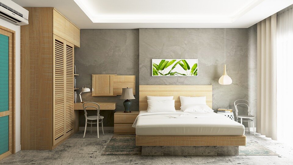
To lighten the mood if you find it necessary, opt for a simple gray paint some shades lighter than the gray of the floor. Being a dark color, the gray benefits from natural light. The subtle transition to softer colors can be done with a cream color used on the ceiling and window frames. Avoid the use of pure white. The light yellow, the sand color, the honey shade, and the very light pink are colors that go very well with the gray that you can choose for the decoration of the walls. Do not forget to make sure that the chosen shades blend well with the overall decor of the space.
Grey
By opting for gray walls, you choose the monochrome palette. In these, it is better not to associate a gray floor with walls of the same shade. The result can be stifling because of the abundance of gray in space. It is better to opt for different gray shades in accent. You will be surprised but the gray is sublimated by the white and yellow shades.
The White
Although pure, sterile white is not a very good combination for gray, there are still many other white shades with which gray works well. Opt for a soft white that softens the space and fills the space between the furniture in the room.
Dark blue
Dark blue may seem like a strange choice but this color may surprise you with its ability to merge with everything around it. In addition to being a soothing shade that fills the space with a sense of calm, the dark blue creates a very elegant look. While gray and white offer a kind of metallic atmosphere, blue creates a perfect "Mediterranean" look for homes around the sea and water in general.
Teal blue
Teal is also a color with which you can not go wrong choosing it as a complementary color for gray tiled floors. When we think "island breeze", "Greece" and "sea spray", we think mostly in white and blue. But then what happens when we mix these two colors? The result is a sophisticated teal color. This color allows you to create a certain atmosphere in the space very often used by professional designers.
Yellow
Yellow is not everyone's favorite color. Many people even refuse to wear a yellow t-shirt, but many others find this color very beautiful. Everything is, of course, a matter of personal taste. But if we have to rely on artistic standards when working with yellow, gray and white are the nuances to choose from. A light yellow may also seem a good idea at first but it is not a good choice for spaces where you will spend a lot of time. It can become irritating after a while.
The green
For green shades including mint green, gray or black are generally very good choices. The mint green gives a feeling of freshness and family at the same time to space. In the color spectrum, it is somewhere between white and blue. The pale green brings out the best aspects of gray floor tiles and also, it gives you all the options to accentuate the walls with green plants. In any case, the green creates a refreshing look inspired by nature.