Сегодня я поделюсь очередной статьей, которую я написала для своих студентов ВШЭ.
В этот раз я подробно остановилась на вопросе визуализации идей, выборе корректных слов, а также поделилась информацией о RAG матрице, которой часто пользуюсь на работе в ходе реализации своих проектов.
1. Visualization:
In order to make an effective slide, first you need to understand what idea you would like to convey on this slide. This idea should be clear and concise. It also needs to be catchy in order to draw attention of the viewer and make him or her study the slide with visual evidence to support the key idea in the header.
Visual evidence ideally should be structured in such a way that a viewer can find and understand the key arguments in 15-20 seconds. If a viewer wants, he or she can dive deeper into the slide and study more details to finalize his understanding of the idea. Overall, it shouldn’t take more than a minute to fully comprehend the slide.
Important to mention, it is very beneficial to have a “so what part” on a slide. This part will call the reader to action making him do what you want him to do.
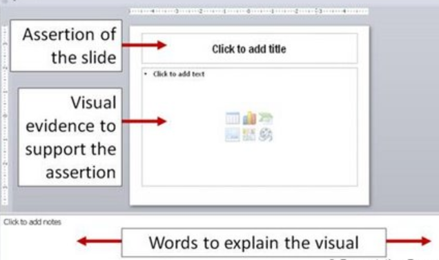
Thus, the structure of your slide will be as follows:
-Key idea of the slide in the header (5 seconds to understand)
-Visual evidence supporting the key ideas structured in two hierarchical parts:
· Key parts of the evidence (15 seconds to understand)
· The rest of the information to support the idea (40 seconds to understand)
-“So what” part calling to action
In order to structure your key arguments, try to work in several steps.
First, put down on the list all the arguments you have under several bullet points.
Second, delete extra words, try to rephrase the sentences so that they become short, concise, and MECE (mutually exclusive and collectively exhaustive).
Third, try to understand what kind of relationship there is between your ideas. There are many dimensions for logical relations. One of them is time, space and quantity. You can read more on this here. Regardless, to the type of logical structure you choose, it needs to be clear for a viewer and support your key idea in a way that is hard to argue.
Forth, visualize. You can choose to use a graph, an image or simple text slide. However, I recommend using a combination of these three, so that there are multiple ways how to understand the idea.
Finally, there is no clear instruction on how to create a good slide. There are only key principles that I have tried to list in this passage.
I provide a couple of illustrations below. The first one demonstrates classical structure of a slide. The second one is from my work where I describe a new solution. The third one provides a brilliant example of how a good slide with a graph and a proper ‘so what’ should look like.
Further reading:
· Recommendation on how to make good slides from TED blog
· Examples of presentations from consulting firms
· The advanced guide to McKinsey style presentation
· Anatomy of McKinsey presentation
· McKinsey presentation tips from Wharton

2. Word choice
You have to be very precise in terms of your word choice. Each word must clearly express your key idea.
Very often, there is a tendency to use overemotional words or words that have negative connotation. It might lead to misunderstandings or even offend the viewer.
In order to avoid such a situation, you need to read carefully your slides several times and make sure you remain professional in your word choice.
What to do:
· Use words with neutral connotation
· Use precise sentences and remove unnecessary words
· Use simple words that an average audience can understand
· Avoid generalizations
· Avoid slang
Further reading:
· Choosing words for presentation
3. Useful matrices
One of the common matrices that you can often find in corporate presentations is RAG matrix.
This matrix is used when assessing risk or completion of project stages. You can also apply it when you need to prioritize certain items in order to make a decision on further actions with a group of objects.
In order to apply this matrix, you need to set three groups of criteria based on which you then allocate your item either to green, amber or red group.
Then, depending on to which group (red, green or amber) an item belongs to, you need to plan actions, e.g.:
· Green – continue work;
· Amber – revise the work plan;
· Red – escalate to the general director
This is also a convenient tool when you work with big excel and need to group and prioritize a large set of numbers.
You can also use it when assessing probability of risk factors based on weights.
Further reading: