So, here it comes next part of article about material design. It will be about basic principles of material Design.
Material Design allows for a more objective approach to making design decisions: how something looks, how something works, how is the animation and so on. She asks reasonable limits, but not unduly limiting.
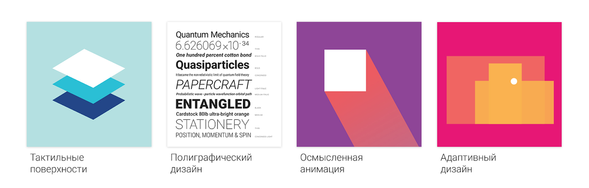
Material Design is based on four main principles:
- Tactile surface. In Material Design interface consists of the tangible layers of the so-called "digital paper". These layers are located at different heights and cast shadows on each other, which helps users better understand the anatomy of the interface and the principle of interaction with him.
- Print design. If you count the layers with pieces of "digital paper", in regard to the "digital ink" (all that is portrayed on "digital paper"), use the approach of traditional graphic design: for example, magazine and poster.
- Meaningful animation. In the real world things do not arise out of nowhere and disappear into nowhere — it happens only in the movies. Therefore, in Material Design we all the time think about how you use animations in layers and in "digital ink" to give the users clues about the interface.
- The adaptive design. Here i’am talking about how we used the previous three concepts on different devices with different resolutions and screen sizes.
So, let’s move in order.
Tactile surface
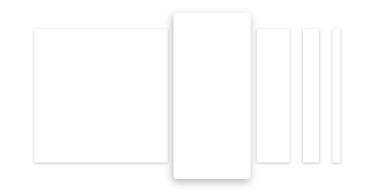
Let's start with the tactile surfaces. These are the pieces of "digital paper", which unlike conventional paper possess superhuman abilities — able to stretch, to connect and to change its shape. Otherwise, behave in full accordance with the laws of physics and the laws of the Russian Federation.
Surface
What is the surface? Basically, it's a “container” with a shadow and nothing more. But that is enough to distinguish one object from another and show how they are located relative to each other. The philosophy of Material Design is kept simple and clean design.
No need to go too far and use a texture to apply gradients to images of light and shade. No need to give visual properties of the skin as in my grandmother's apartment door — a neat shade can Express a lot. But each surface has its height located on the z-axis And each surface casts a shadow on the bottom, as in the real world.
Depth
In the traditional "flat design" avoid these shadows, like all forms of volume, but they perform an important function indicate the structure and hierarchy of elements on the screen. For example, if the lifting element more, and the shadow has more. This increased depth helps to focus the user's attention on the critical things and do it gracefully.
The depth also sets the hints on the interaction. Here as the user makes it scroll, green dice sticks to the top layer and added a shadow. It shows that we are moving not only the "ink" and the white background is below and moves as a whole.
It is important to note that the depth is “bottom”. It is assumed that it is limited by the thickness of the mobile device. That is, if the smartphone is a inch from the glass to the back wall, and you have the interface have a credit card, it not just flip — it touches the glass and back wall.
(end of the second part)
ссылка(и) на источник(и): https://habrahabr.ru/company/redmadrobot/blog/252773/
Translated: Ilya Zhidkov