1,0×
00:00/00:12
Описание
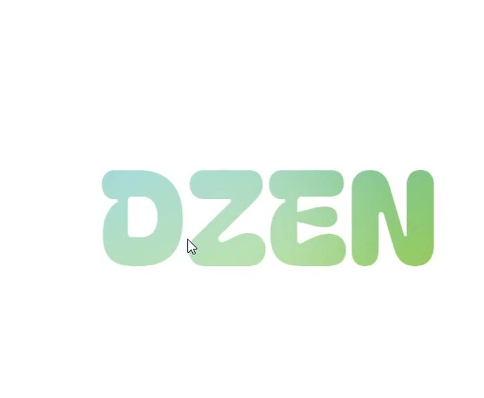
Смена градиента текста при передвижении курсора мышки
10 месяцев назад • 61 просмотр3 поставили "Нравится"
Смена градиента текста при передвижении курсора мышкиФАЙЛ HTML:
<div class="holographic">DZEN</div>
ФАЙЛ CSS:
.holographic {
--angle: -22deg;
--space: 6%;
--x: 50%;
--y: 50%;
align-items: center;
background-clip: text;
background-color: #d8d8d8;
background-image:
repeating-linear-gradient(
var(--angle),
hsla(283, 50%, 60%, 0.75) 6%,
hsla(2, 75%, 60%, 0.75) 12%,
hsla(53, 70%, 50%, 0.75) 18%,
hsla(93, 55%, 50%, 0.75) 24%,
hsla(176, 40%, 50%, 0.75) 30%,
hsla(228, 100%, 80%, 0.75) 36%,
hsla(283, 50%, 60%, 0.75) 42%,
);
background-size: 300% 400%;
background-position:
0% calc(var(--y) * 1),
var(--x) var(--y);
color: transparent;
display: flex;
font-size: 200px;
height: 100%;
justify-content: center;
left: 0;
position: absolute;
top: 0;
width: 100%;
&::after {
background-color: #fff;
border-radius: 50%;
box-shadow: rgb(255, 255, 255) 0px 0px 150px 150px;
content: '';
height: 250px;
left: var(--x);
mix-blend-mode: soft-light;
position: absolute;
transform: translate(-50%, -50%);
top: var(--y);
width: 250px;
}
}
body {
font-family: 'Bagel Fat One', cursive;
height: 100vh;
min-height: 100vh;
}
ФАЙЛ JAVASCRIPT:
const text = document.querySelector('.holographic');
text.addEventListener('mousemove', (e) => {
gsap.to(text, {
'--x': `${(e.offsetX/window.innerWidth)*100}%`,
'--y': `${(e.offsetY / window.innerHeight)*100}%`,
});
});